rosemarie tissi
For this project in my Design Process Context and Systems class, I was commissioned to design a poster, a GIF, and a digital mock up of a designer based on a list provided by my professor. I used the design system principles discussed in class to develop proposals for the publications.
rosmarie tissi poster
year
2022
typeface
stratos
size
11x17
colors
red, blue, yellow, purple, white, black
.jpg)
process
I began my process by picking an artist and a piece of theirs to study and recreate. After conducting research on my chosen graphic designer, Rosmarie Tissi, I found that she had a fond relationship with solid colors and geometric shapes. Keeping this in mind while studying her graphic work "International Music Festival - Lucerne," I was able to create several beginning-stage iterations of my poster design.


past iterations


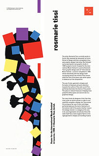

In my early poster iterations, I kept a consistent theme of color and layout. I wanted to replicate the solid color and geometric shapes that Tissi so heavily focused on in her works. While looking over these pieces, I felt as if the design could have a more engaging feeling and look to match the concept of music. I added the "confetti" shapes to add a feel of movement to encapsulated the theme of music vibrations and their movement around a room. (These changes can be seen in the final version up above).
alternative designs
While designing the final version of the poster, I decided it would be worthwhile to create alternative designs that could be used in different ways. Each alternative design consists of the same color and shapes but presented differently to evoke a different feeling from the viewer.


gif animation
After creating the alternative designs to my poster, I decided to put them to good use and create a GIF out of my final poster design and the alternative designs. As stated previously, I wanted to create a confetti-like feel to the poster design and wanted to incorporate that into my GIF design.
mockups
For the final stage of this project, I wanted to show off my work and accurately illustrate what these designs would look like in the real world. I wanted to communicate that my design was not solely created to serve as a poster, but instead, could be something bigger, like even a mural!

